To help Cities United with its verbal identity, the IDEO team defined the organization's voice, tone, and key messages, making it easier to tell its story more consistently and clearly, a crucial step toward engaging stakeholders.
To define the new visual identity, the team created a new logo, a letter C composed of interwoven shapes that represent the three tenets of their vision—“safe, happy, and hopeful;” a new design language that references city grids; and a typographic system anchored by the typeface VTC DuBois, inspired by W.E.B. DuBois’s own custom lettering and designed by the Black-owned Vocal Type Co. The team also designed a color palette that embodies the textures of city life with hues reminiscent of asphalt, sunrise, and brick.
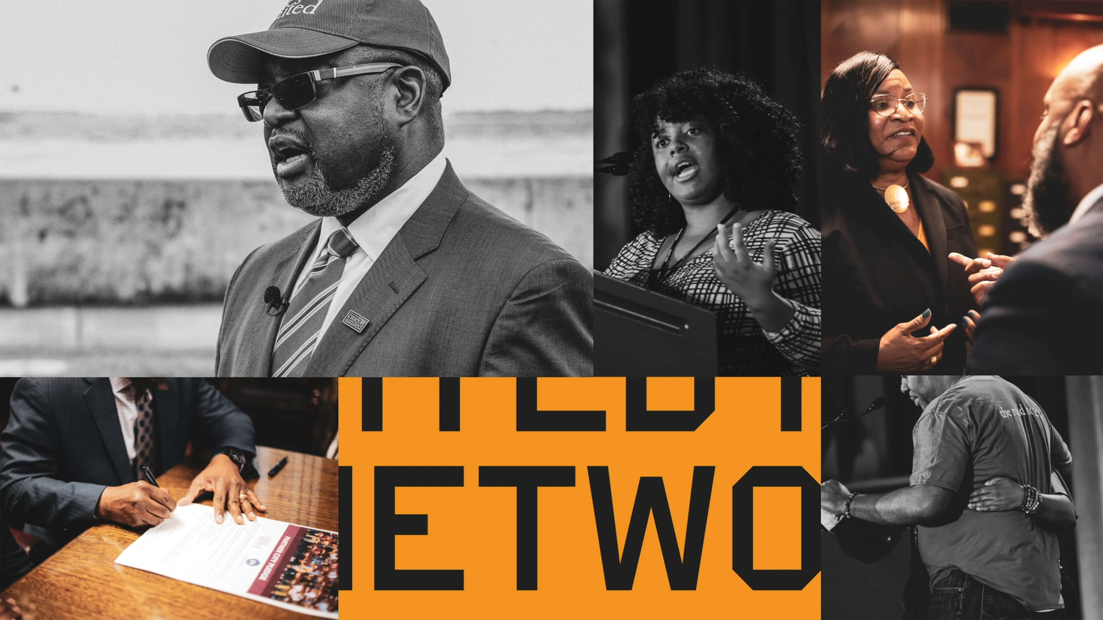
To amplify the refreshed branding, the team designed a new responsive website, citiesunited.org. The intuitive site shares the organization’s mission, resources, ongoing projects, and partner network, inviting stakeholders to join in their transformative work. IDEO also created a video to humanize Cities United’s mission and showcase its nationwide impact. It underscores the unity, resilience, and hope embodied by the organization through a chorus of voices.
This comprehensive rebranding widens Cities United’s reach and impact, helping the organization share its goal of creating safe, healthy, hopeful communities for young Black men, boys, and their families, and reintroduces the organization to a national audience.
The Cities United work was supported by IDEO’s Racial Justice Impact Fund, part of a commitment IDEO made in 2020 to address systemic racism and advance equity within our own organization, our client work, and beyond.


